Sound Moves 55+: New Logo
14 May 2026
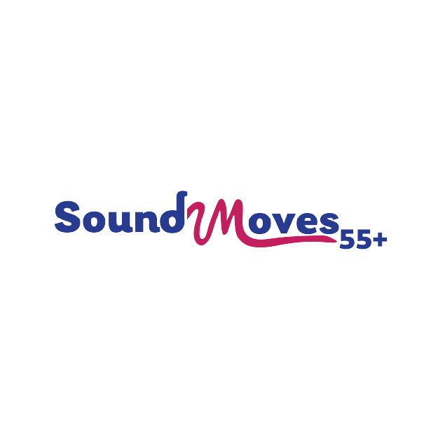
Some projects are simply fun from day one — and creating the new Sound Moves 55+ logo was definitely one of them.
Sound Moves 55+ is a purpose-driven organisation focused on helping older adults improve health, wellbeing and social connection through dance and movement programs designed specifically for people aged 55 and over. Their vision extends beyond traditional dance programs, creating accessible experiences for people of different abilities, backgrounds and locations through both in-person and digital experiences.
When developing the new logo, our challenge was to create something that felt energetic, welcoming and fun — while also remaining clear, professional and accessible for older audiences. Importantly, the logo also needed to appeal to both men and women, helping encourage broader participation and ensuring the brand didn’t feel overly feminine or exclusive.
The process involved collaboration, research and exploration to understand both the organisation’s purpose and the people it exists to support. Throughout the process, we explored how movement, music, health and connection could be represented visually without feeling overly clinical, overly youthful or stereotypical.
The final logo combines bold colours, clean typography and movement-inspired forms to create something energetic, approachable and memorable while remaining easy to reproduce across digital, print and merchandise applications. The final logo suite includes multiple layouts, colour variations and accessibility considerations for different applications.
Even more exciting — this is only the beginning. We’re currently working with the Sound Moves 55+ team on their new website, which is helping shape and expand the visual direction even further — and honestly, that project is proving just as much fun as the logo itself.