— CASE STUDY —
It Takes a Village
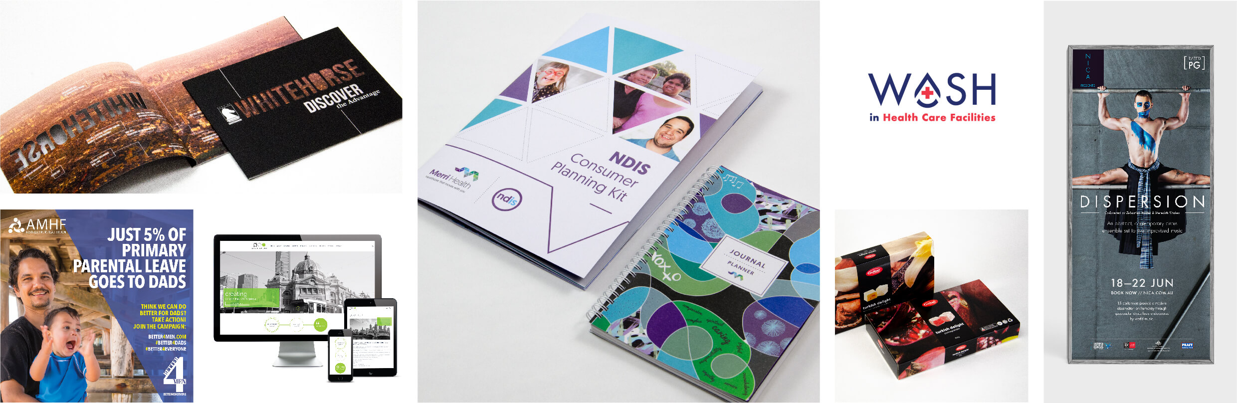
It Takes A Village Co-Design, Branding and Website
Website design / Custom website development / Accessibility / Logo / Branding / Stationery
Reimagining the Future of Community Childcare: From Co-Design to Launch
Background
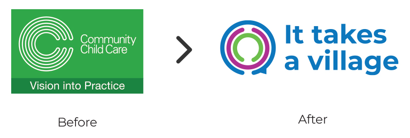
Formerly known as Community Child Care (CCC), It Takes a Village (ITAV) is a leading advocate for quality early childhood education and community-based care across Australia. In 2023, ITAV partnered with Blick Creative to undertake a complete rebrand and digital transformation.
The initiative began with a co-design process aimed at understanding the organisation’s evolution and aspirations — developing a new brand that reflected ITAV’s inclusive, people-centred values while positioning it as a forward-thinking leader supporting children, educators, and communities nationwide.
Solution
Co-Design and Strategy
Through an in-depth co-design workshop, Blick collaborated with ITAV’s leadership and key stakeholders to identify the motivations behind the name change and the strategic direction for their next chapter.
From these sessions, Blick developed a reverse brief that articulated ITAV’s vision for a refreshed identity — one that celebrated their decades-long legacy while embracing modernity, inclusivity, and advocacy for the early education sector.
Naming and Brand Identity
The name “It Takes a Village” emerged as the perfect expression of ITAV’s philosophy — that raising and supporting children is a shared community responsibility.
The new logo pays subtle homage to the original CCC identity, symbolising connection, care, and collaboration through interwoven shapes and soft colour transitions. This approach reinforced the organisation’s commitment to nurturing both children and the communities that support them.
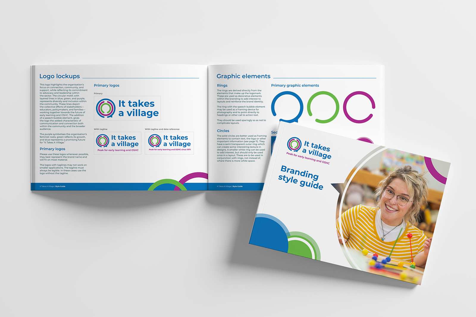
Visual Branding
Blick Creative produced two complete brand concepts, showcasing how the new identity could live across diverse materials — from stationery and brochures to PowerPoint templates and social media graphics.
Following selection of the preferred direction, a comprehensive brand and style guide was created, detailing accessible typography, colour contrast ratios, image guidelines, and ready-to-use templates.
The resulting visual identity conveys warmth, inclusivity, and professionalism, aligning with ITAV’s advocacy and leadership within the early childhood and out-of-school-hours care sectors.
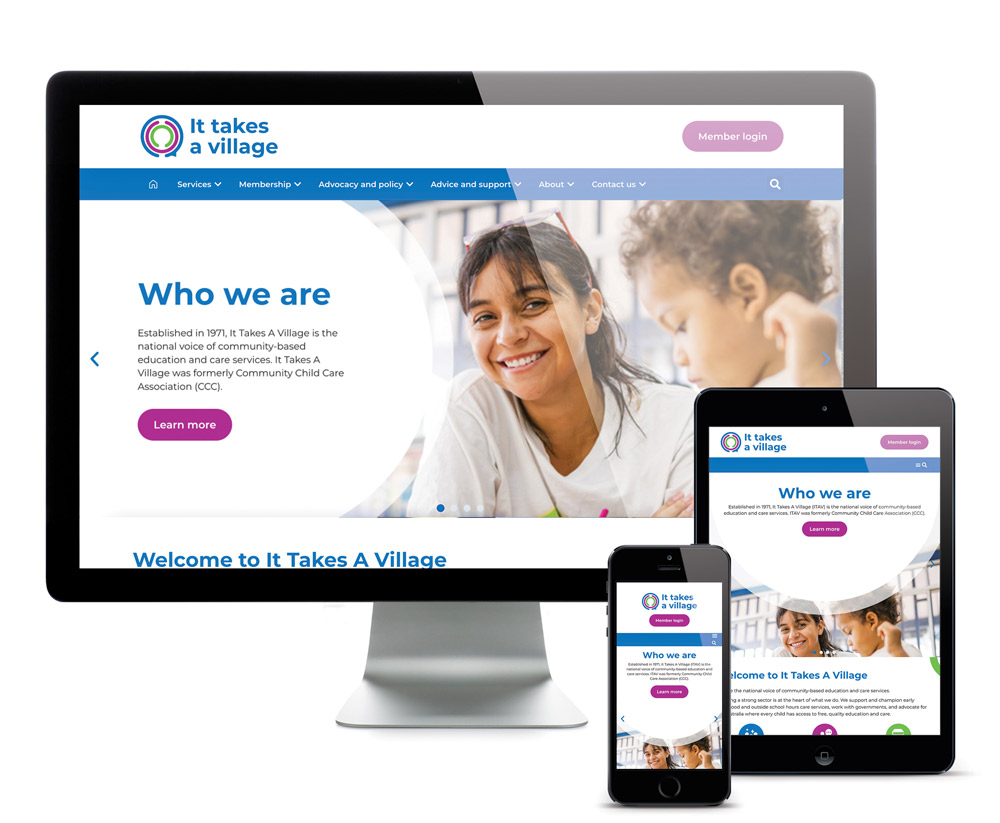
Digital Transformation: Website and CRM
The new itav.org.au website brings the rebrand to life online, combining accessibility, visual clarity, and robust functionality.
Developed in WordPress, the site integrates:
-
Groundhogg CRM, enabling automated communications, member management, and streamlined workflows.
-
Event Tickets Plus, supporting bookings for training, workshops, and professional development events.
-
Smash Balloon social feeds, providing live updates and sector news directly on the homepage.
Designed to meet WCAG AA accessibility standards, the website ensures seamless navigation, clear pathways to key programs and advocacy initiatives, and an empowering digital experience for members and staff alike. The flexible system allows for ongoing scalability as ITAV’s services continue to evolve.
Outcome
The ITAV rebrand has unified the organisation’s identity across digital and print touchpoints, reinforcing its reputation as a trusted voice in community-based education and advocacy.
Key results include:
-
Logo – modern yet rooted in heritage, symbolising unity and collaboration.
-
Branding – flexible, accessible, and engaging across all communications.
-
Website and CRM – a future-ready digital platform that connects, informs, and inspires.
The new identity empowers ITAV to continue leading the conversation on quality, inclusive childcare — reflecting its belief that it truly takes a village to raise and support every child.
Explore the new brand and website at itav.org.au.