Omega Support — Logo Refresh
25 August 2025
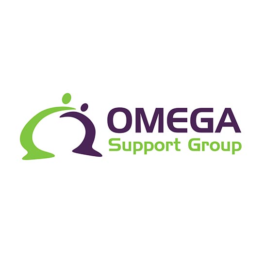
Blick Creative is proud to present a refreshed logo for Omega Support, building on their existing brand while giving it a clean, modern update.
The original logo — featuring the distinctive Omega symbol — has been retained as the foundation, ensuring strong recognition. We removed the tagline for a simpler, more versatile look, refined the typography for improved accessibility, and subtly refreshed the colour palette for a brighter, contemporary feel.
Multiple variations were explored, all maintaining the Omega symbol and incorporating a subtle human element that reflects care, connection, and community — core values of Omega Support. The final selection offers balance between brand heritage and forward-looking design.
Delivered in a complete logo suite with a mini style guide, the update positions Omega Support with a professional, accessible image for the future