— CASE STUDY —
Whitehorse Manningham Regional Libraries
Re-Brand of Eight Libraries
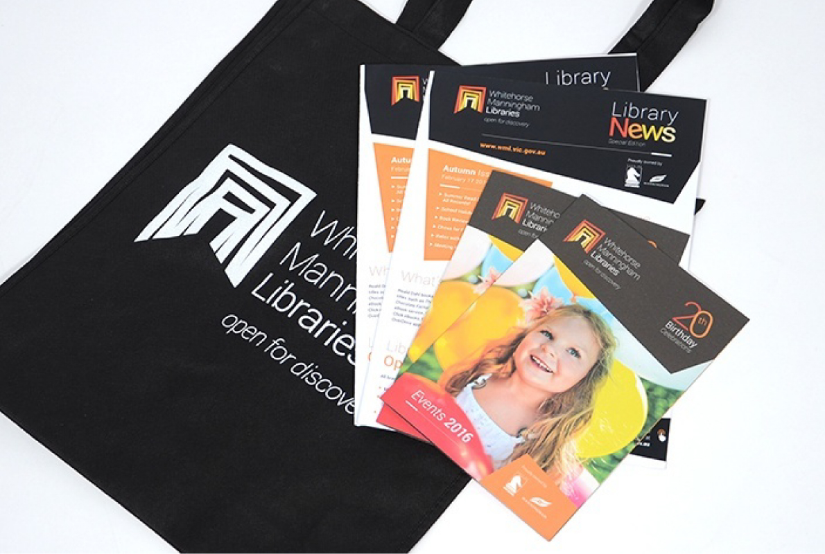
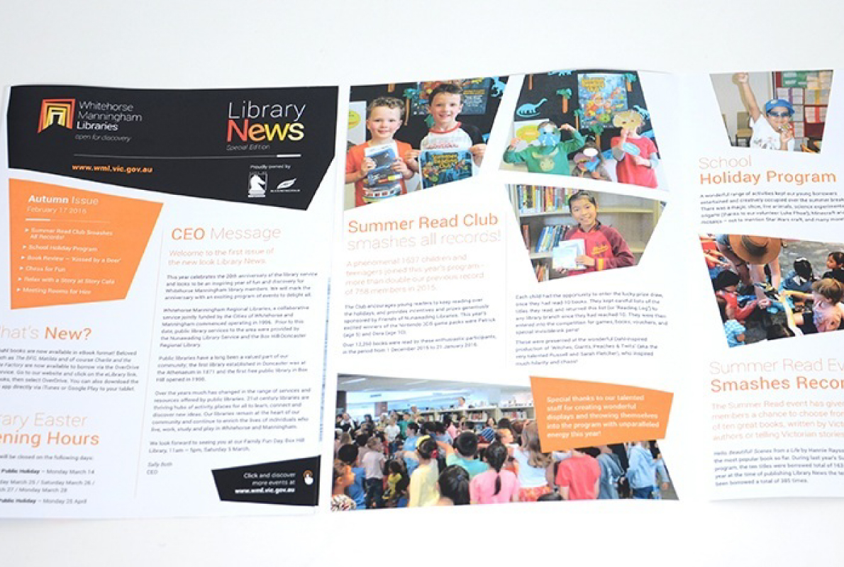
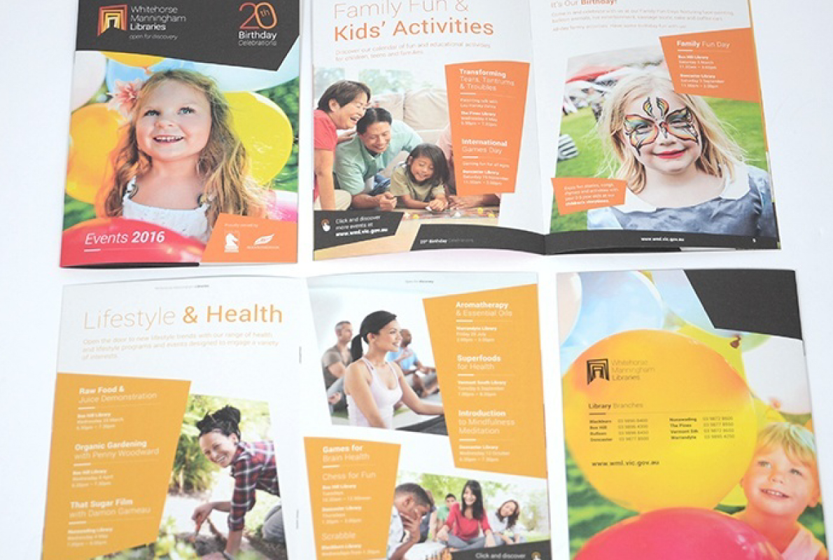
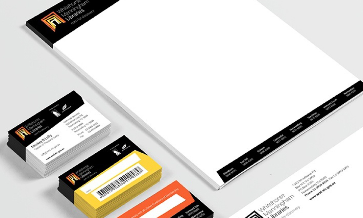
Identity and logo design/ Tagline creation / User research and focus groups / Style guide / Stationery / Booklets / Event posters / Pull-up banners / PowerPoint presentation templates / Brand launch collateral
The Whitehorse Manningham Regional Libraries provide public library services to the City of Whitehorse and City of Manningham. The government organisation consists of eight branches across the north-eastern suburbs of Melbourne. They contribute a great deal to the community by bringing people together, cultivating creativity, providing learning opportunities and offering a welcoming space to all members of the public.

Brief
Blick was enlisted to design a new logo that reflected the organisation’s role in attracting diverse clientele and providing spaces that stimulate discussion, debate, learning, knowledge and creation.
The new identity needed to convey the libraries’ scope of services, culture, people and modernity. It was for use across all internal and external communication, such as documentation, print, digital, as well as indoor and outdoor signage. For this reason, it had to be strong, symbolic, and easily applied at both small and large scales.
Approach
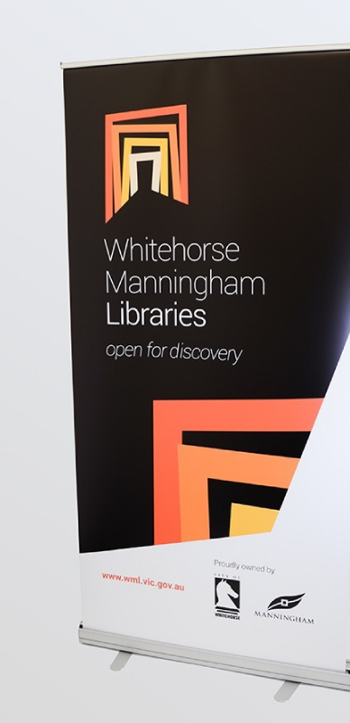
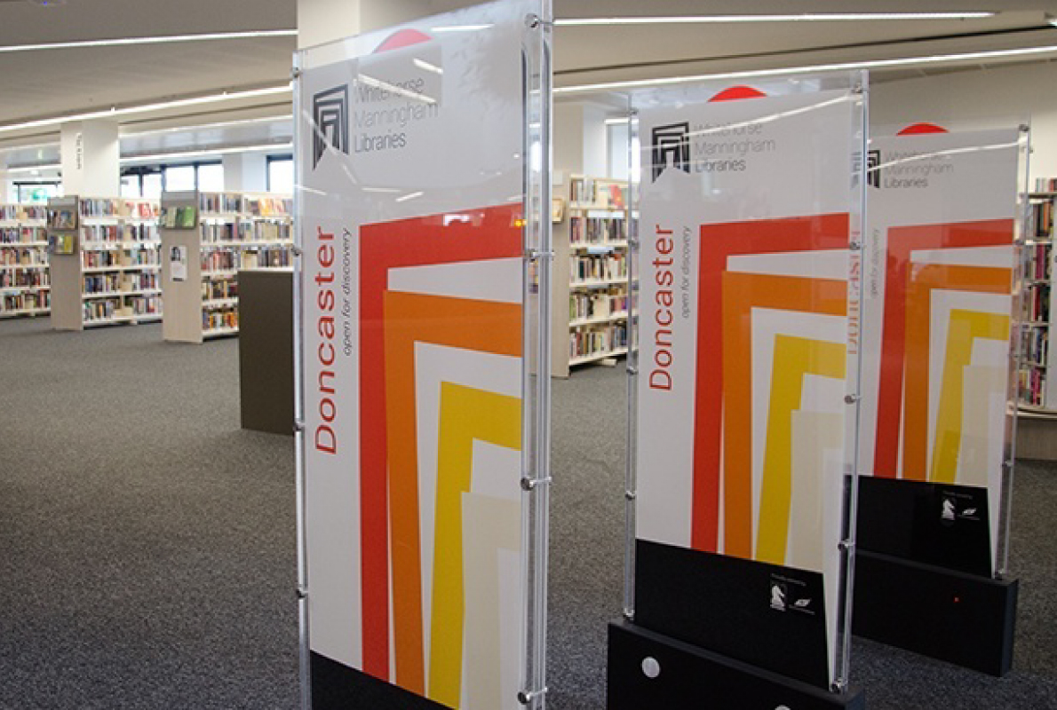
Whitehorse Manningham Library – Banner
Blick conducted user research to clearly define the project’s parameters, which included findings from first-hand consultation with internal and external stakeholders. We also led focus groups with library staff at various levels, as well as community surveys in English and Chinese, both online and in hard copy format.
Using key findings, we created a detailed reverse brief outlining the need for a logo that signified the friendly nature of the Whitehorse Manningham Libraries, as well as their function as a gateway to learning, diversity, creativity, technology and collaboration.
Our unique design uses warm and inviting colours to convey a sense of safety and comfort. The different sized doorways show that both adults and children can step into this world of opportunity, explore their interests, connect with others and get lost in the material. The door does not discriminate and invites everyone to come in and enjoy the libraries – a series of welcoming cultural hubs that embrace diversity, nurture potential and open doors to the future.
Blick also devised the accompanying tagline — open for discovery — to compliment the logo’s meaning and further the message that everyone is welcome.
Result
The new logo is open, welcoming, and effectively references social diversity. It reflects the community-focused characteristics of the libraries and suggests a transition from traditional library services to modern-day services and technology.
As one library staff member said, “Blick has brought the Whitehorse Manningham Libraries brand into the 21st century” – an instantly recognisable brand for consistent use across a range of mediums, which will remain representative of the organisation for the next 20+ years.
At the official brand launch it was apparent that all stakeholders have embraced the new identity. There was a real sense of excitement and ownership of the brand across all levels of the organisation – a perfect result for Blick and our client.