— CASE STUDY —
Deafblind Australia
Deafblind Australia Co-Design, Website and Branding
Website design / Custom website development / Accessibility / Branding / Stationery
Enhancing Accessibility for Deafblind Australia
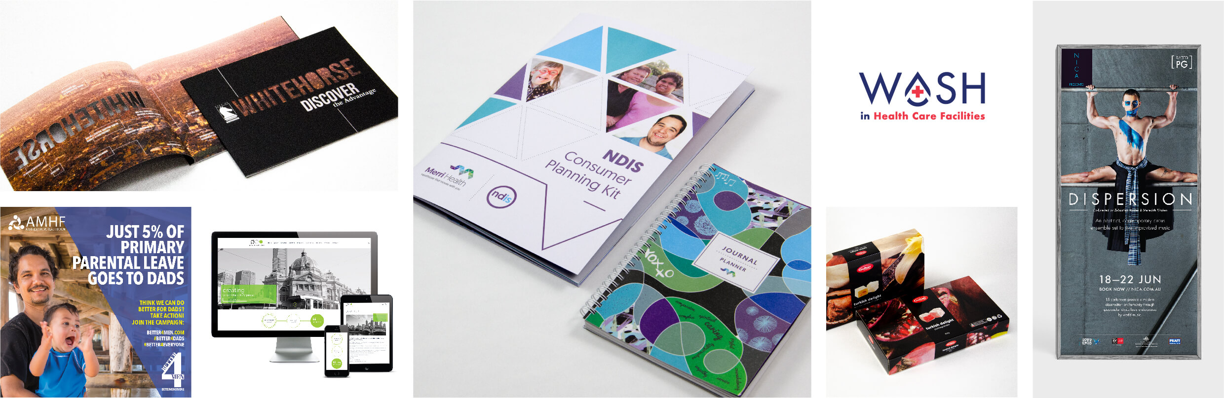
Background: Deafblind Australia (DBA) is an organisation dedicated to empowering individuals with combined hearing and vision impairments. Seeking to revamp their brand identity, DBA embarked on a comprehensive rebranding initiative covering logo design, stationery, promotional materials, and website development.
The project posed unique challenges, particularly in ensuring accessibility for individuals who are deaf, blind, or deafblind. It demanded careful consideration of readability, tactile engagement, and ease of access across all materials.
Solution:
- Co-design Sessions: Our partnership with Deafblind Australia on reimagining their branding has been an enriching experience. Engaging in co-design sessions and attending their specific events offered us priceless perspectives on their distinct needs.
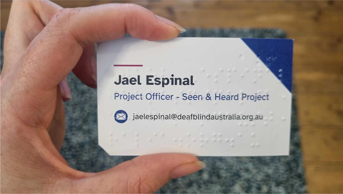
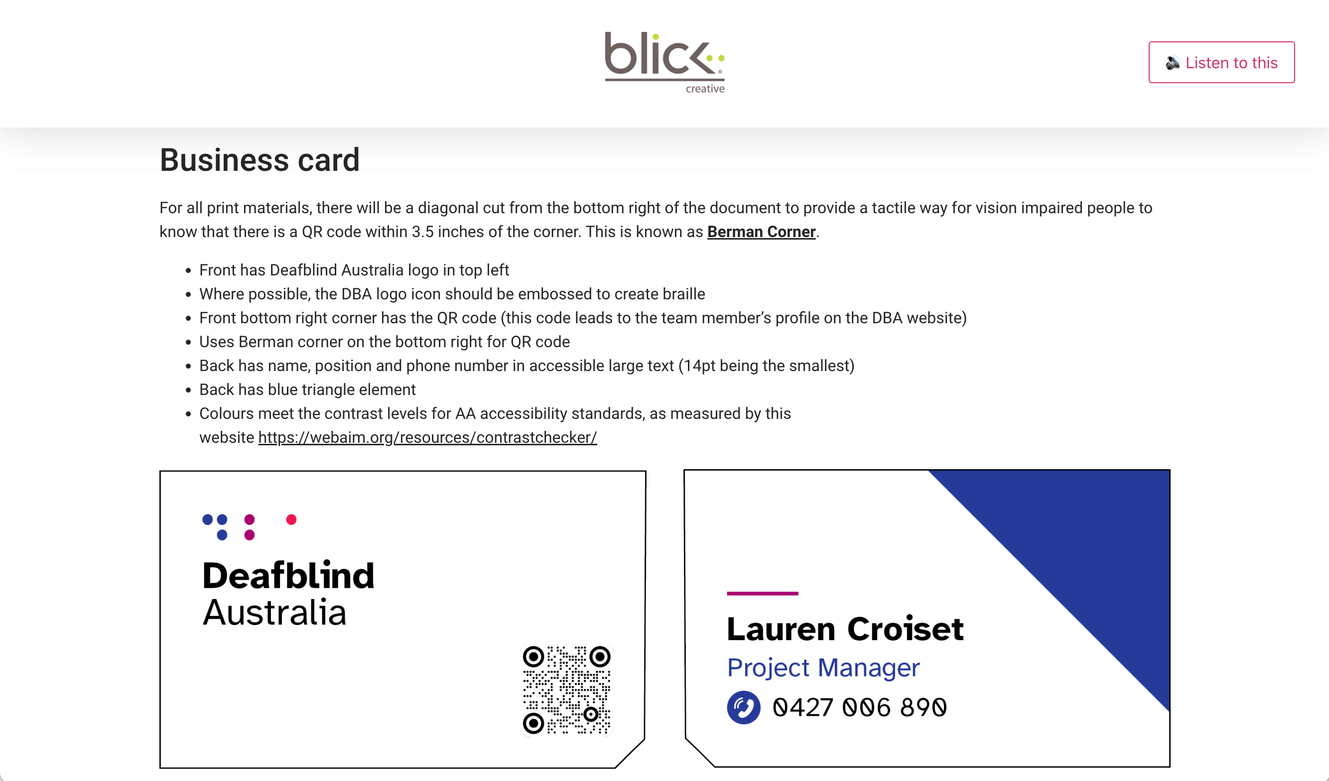
- Logo Design and Branding: The logo ingeniously incorporated the acronym “DBA” in braille, providing a tactile representation of the organisation’s name. This allowed for the embossing of braille on printed materials, enhancing accessibility.
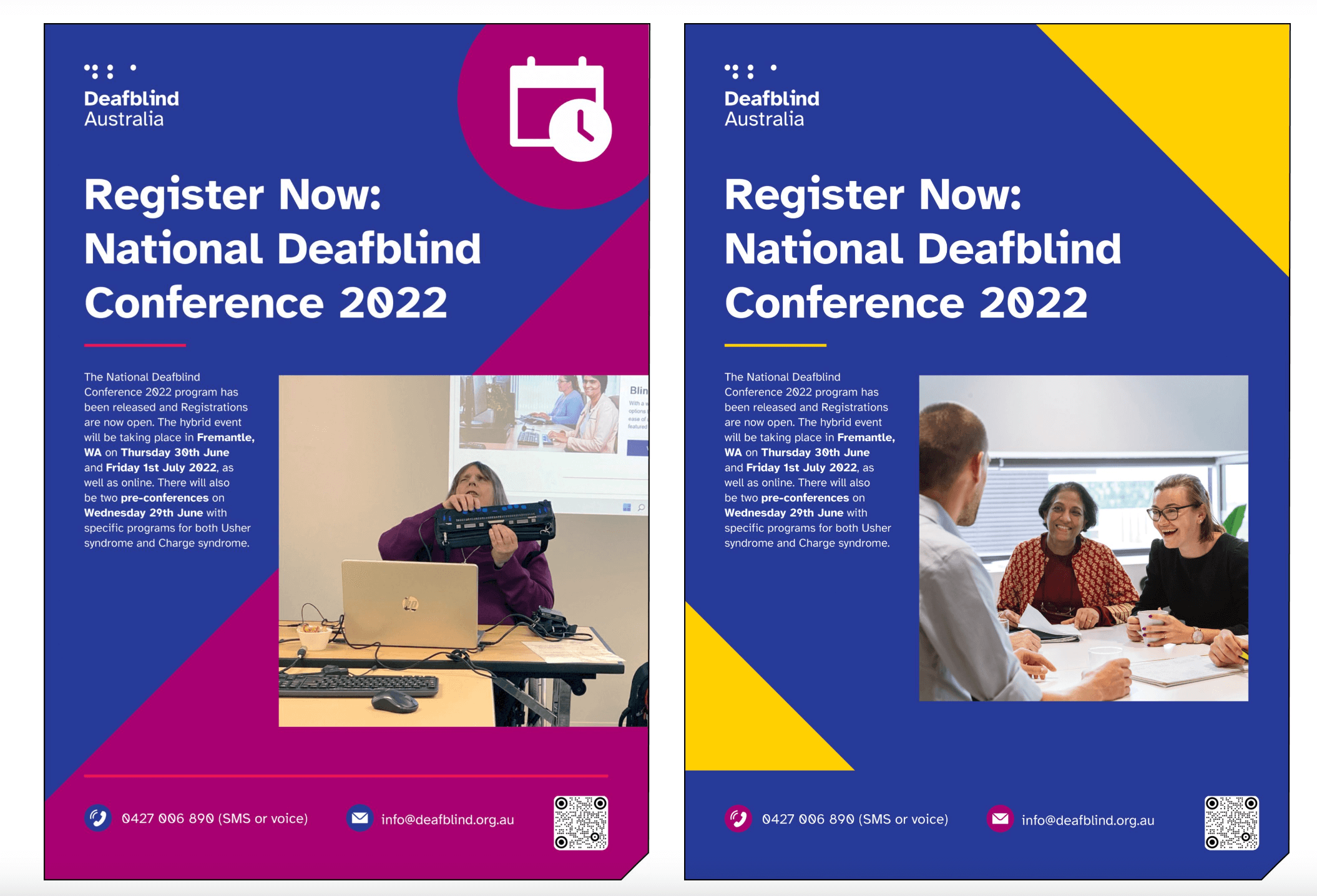
- Colour and Font Accessibility: At every stage of the branding process, accessibility was a pivotal consideration. This included choosing a highly legible font and colour schemes that enhance contrast for print materials, ensuring readability for all audiences, including those with visual impairments.
- Innovative Business Cards: Blick took the lead in designing accessible business cards that feature debossed braille for logos and contact details, with the assistance of Vision Australia. We introduced “Berman’s Corner” to signal essential information, guiding users to a QR code that connects to the employee’s profile on the DBA website. This addition improves accessibility via screen reading technologies.
- Multiple Accessibility Layers: To cater to diverse accessibility needs, each business card was embossed with braille by Vision Australia, providing yet another method for conveying information. This multi-layered approach ensured inclusivity through braille, colour/font contrast, QR codes with Berman Corners, and tactile cues.
- Consistent Approach Across Materials: Accessibility features were seamlessly integrated into event posters and brochures, maintaining uniformity and inclusivity throughout all promotional materials.
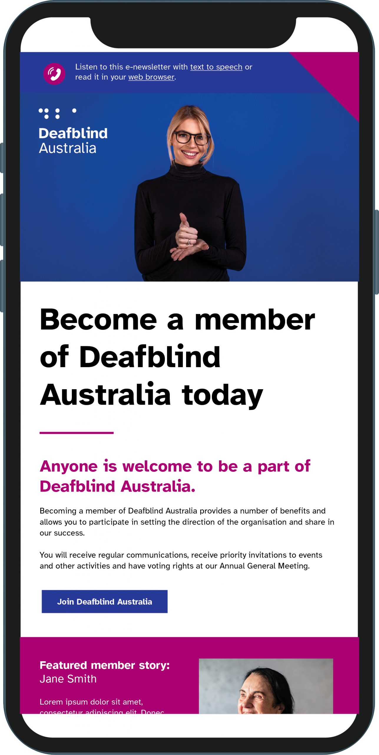
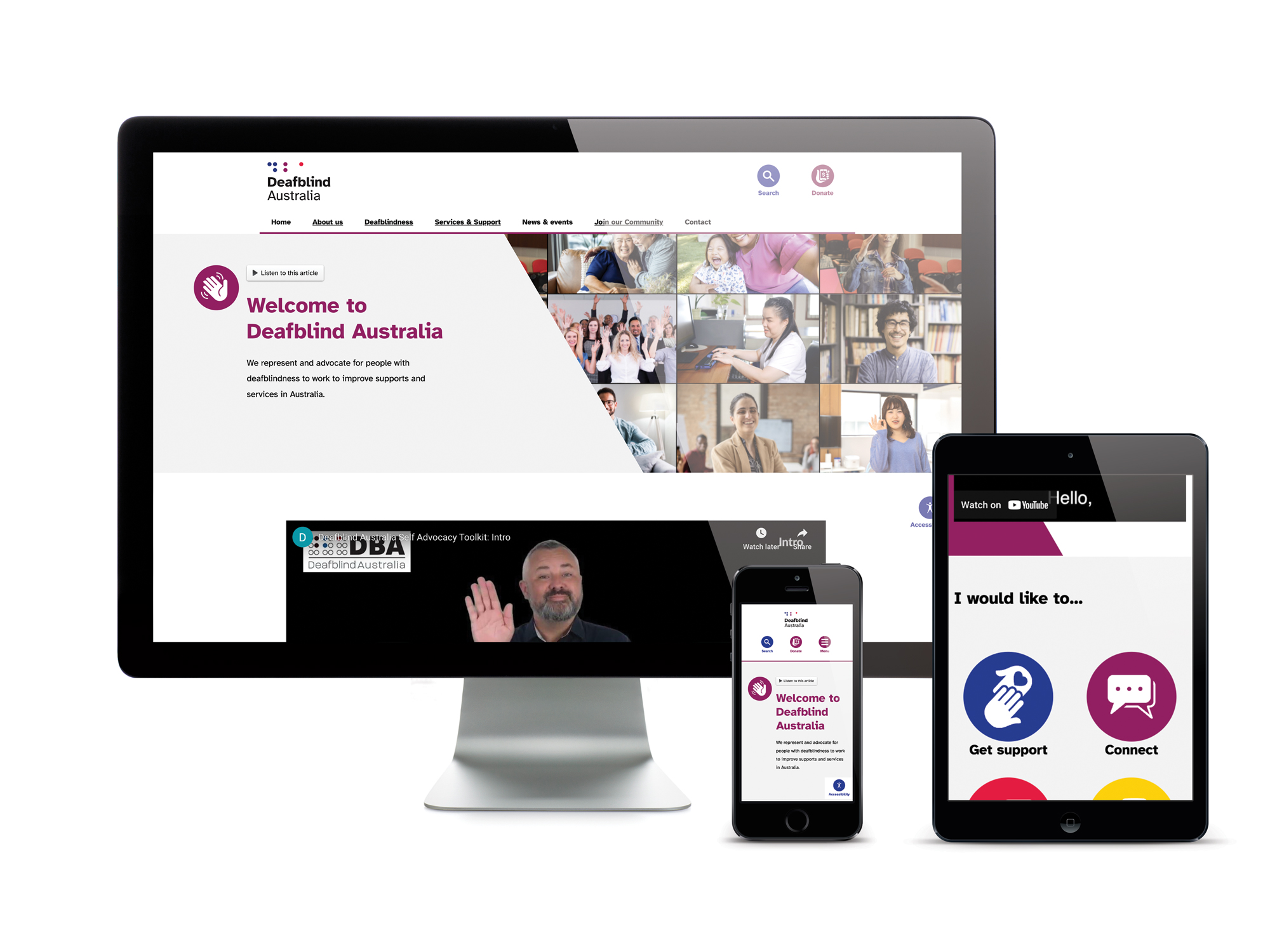
- Website Accessibility: The website was meticulously designed and developed to meet strict WCAG AAA standards. Accessibility tools, including text-to-speech functionality, were implemented to facilitate seamless navigation. Additionally, videos were provided with AUSLAN interpretation, closed captions, and transcriptions, ensuring accessibility for all users.
Conclusion: Through innovative design solutions and a commitment to accessibility, the rebranding initiative for Deafblind Australia successfully addressed the unique needs of individuals with combined hearing and vision impairments. By incorporating tactile elements, colour/font contrast, and advanced accessibility features across all materials, DBA is better positioned to communicate its mission inclusively and effectively.