Exploring the psychology of fonts and their impact on brand perception
26 April 2024
Sans-serif fonts, on the other hand, project a clean, modern, and approachable vibe. These fonts are a popular choice for tech companies and startups, as they communicate a forward-thinking and streamlined approach. For many, fonts might seem like a purely aesthetic choice. But delve deeper, and you’ll discover a fascinating world of psychology at play. The typefaces we choose can significantly impact how consumers perceive a brand, influencing emotions, associations, and ultimately, brand image.
The Secret Language of Fonts
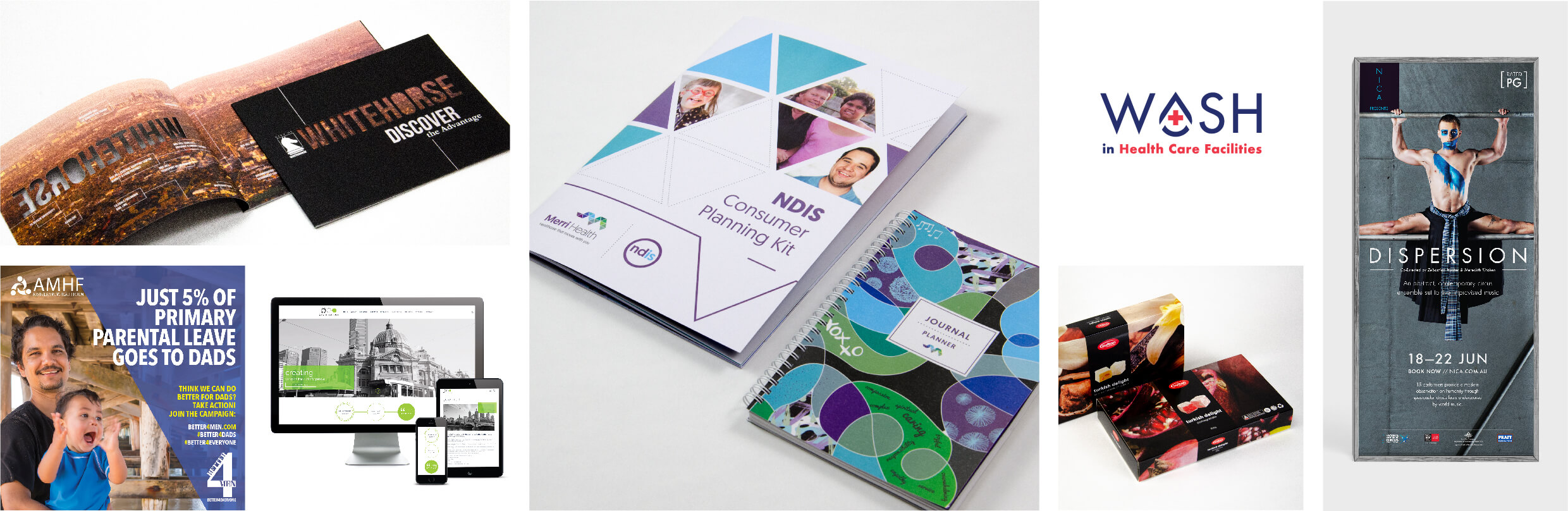
Our brains are wired to make snap judgments based on visual cues. Fonts are no exception. Different typefaces evoke distinct emotions and associations. Understanding this “font psychology” empowers businesses to make strategic choices. Blick’s Senior Designer and resident font guru, Ella Rasmussen, emphasises this, “The typeface should strongly link to the core brand personality and message. As an example, Deafblind Australia’s use of the highly legible Atkinson Hyperlegible font embodies their commitment to inclusivity and accessibility. It gives the brand authority while remaining approachable and inclusive of their diverse community”.
“The typeface should strongly link to the core brand personality and message. As an example, Deafblind Australia’s use of the highly legible Atkinson Hyperlegible font embodies their commitment to inclusivity and accessibility. It gives the brand authority while remaining approachable and inclusive of their diverse community”.

The Psychology Behind the Perception
But how exactly do fonts influence our emotions? The answer lies in how they shape our reading experience. Ella highlights, “Words can have different meanings when presented in different typefaces, influencing how we feel when the words are being read. Serif fonts, with their familiar details, create a sense of trustworthiness, while the clean lines of sans-serif fonts suggest a more modern approach. Scripts can be considered unique and personal and decorative typefaces are more creative, original, and flexible.”.
Serif fonts, like Times New Roman or Garamond, feature small decorative strokes at the ends of their letters. They evoke a sense of tradition, authority, and sophistication. Often used in legal documents and high-end publications, serifs convey trust, reliability, and timeless elegance. Think of serif fonts as the tailored suit of the font world – perfect for brands aiming to project a sense of heritage and prestige.

Sans-serif fonts, on the other hand, project a clean, modern, and approachable vibe. These fonts are a popular choice for tech companies and startups, as they communicate a forward-thinking and streamlined approach.

“Script fonts”, says Ella, “can be considered unique and personal and decorative typefaces are more creative, original, and flexible”. Script fonts are reminiscent of handwriting, are personal evoke a sense of creativity, playfulness, and informality. Think of script fonts like Pacifico or Lobster – perfect for brands targeting a younger audience.

Bold and eye-catching, decorative fonts like Blaka or Kavoon scream personality. They are ideal for grabbing attention and conveying a sense of fun, energy, and nonconformity. However, similar to script fonts, decorative fonts can be difficult to read in large blocks of text.

Font Trends: What’s Hot Now?
The world of branding is constantly evolving, and so is font usage. Bold typefaces are making a splash, grabbing attention and boosting memorability. Highlighted text, two-colour headlines, and even playful combinations of italics and outlines are being used to emphasise key messages.
Avoiding Font Faux Pas
Choosing the right font is crucial. Here are some common mistakes to avoid, as highlighted by Ella:
- Illegibility: A fancy font that’s hard to read creates a negative first impression.
- Personal preference over brand identity: Choose a typeface that aligns with your brand, not just your taste.
- Mimicking the competition: Don’t get lost in the crowd. Select a font that fosters brand recognition.
By understanding the power of fonts and using them strategically, businesses can craft a brand identity that resonates with their target audience and leaves a lasting positive impression.
Ella advises when deciding on a font for your logo, branding guidelines, website or marketing collateral, “What is the brand’s primary message and how do you want to be perceived by your audience? Select a font with an aesthetic that has a strong link to the core brand personality and message. Different typefaces trigger different cognitive processes in the minds of readers as well as influencing how the brain learns and remembers information”.
If you need help in selecting a font or typeface or advice about your brand identity please contact Blick Creative info@blickcreative.com.au.